Editing Techniques
Things I aim to IMPROVE on and learn:
Colour grading is an essential part of any successful visual product. When a product is colour-graded, it improves its overall visual quality. This can help attract an audience and keep their attention for longer, as people feel naturally inclined to watch a product that looks good and improves their viewing experience. Colour grading itself helps to set both the tone and mood of your product as you can control things such as brightness, contrast and colour balance. These are something I have looked greatly into, as a means to improve my editing capabilities from previous products as I identified this as a weakness of mine, due to various shots looking grainy and sometimes too dark or dull. Videos like these, have seriously helped my ability to colour grade, as shown in test products I have worked on, as well as in actual work for clients. If I can nail it down, then being able to colour grade correctly, will be the difference between me creating an average product and a great one. Therefore, is vital that I improve my knowledge of the topic, as it can seriously affect my overall outcome.
Transparent text is a simple yet effective feature when it comes to editing. It is a simple way to create an aesthetic look on a specific shot. I have wanted to learn how to do this effect for a while, but I haven’t yet worked on a project that could require such an effect. In my opinion, this style of effect looks best within a product with a lot of B-Roll, as it looks best with a one-word phrase, for example, the name of something or an emotion. This is effective, as you can then pair the effect up with the corresponding B-Roll, for instance, if you were to go with an emotion you could use the word sad paired with a shot of a dark and rainy scene, something a lot of people would correlate with the emotion. On the other hand, if I were to use this in a past project, I would probably use the name of a series or circuit, for example, the BTCC paired with a B-Roll shot of a car passing through the shot. Simple things like these, help to make an effect more effective and aesthetic, especially in a product which relies so heavily on the aesthetic feel in order to have the required effect on your audience.
Something I came across whilst searching for editing tips, was this video which I found both interesting and helpful. The reasoning behind this is that I feel it will help me to not only improve the overall quality of my product but will also help me to speed up the editing and post-production process by eliminating the main time consumer of my product, which will be the colour grading process. This is the longest factor as it requires me to go through every single product and make sure they all look the same, in terms of lighting, colour tone etc. That was until I came across this video, which provided me with a new way of colour grading, that is both effective and takes up minimal time. The video provides me with a new alternative to make my own products look like some of the top films in terms of colour. This is good for my product as if there is another product I have taken inspiration from, it then allows me to become more accurate with my interpretation of it. This is done by being able to take a clip from a film or pre-existing product and copying the colouring straight from that frame onto your own, which I feel is a very effective way of colour grading a product, as it will cut the time down immensely if it works. This is something I will test out in a practise product, where I aim to recreate a past product I made.
EXAMPLES of these in my work:
This product is one I worked on recently for a client, the request was to create a recruitment video for the company, showing off some of the best projects they have worked on. This product is a great example that shows off the editing skills and techniques I have learnt. A focus of this product was the on-screen graphics I have used throughout. I feel like these have helped to back up my own opinions and statements, which I felt would help me in making my own product look better than prior projects I have worked on. In my opinion, the graphics on this product, help to compliment the scenery of each shot, whilst being able to provide the correct information that’s needed.
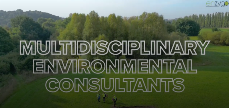
This is a great example of the use of the graphics in this product, as I have used a transparent text graphic to display information on the screen at the same time. This is something I wanted to work on and learn, as I feel that specific effect, is effective for this style of work. This is because, I feel it adds to the aesthetics of the product, especially if the font and size of text compliments the shot on screen. For me, this was done effectively within this shot, as the white text adds nicely to the shot behind, as the workers walk through the field. The simplicity of this shot is great for adding text onto the screen, as there isn’t a lot going on in the shot, so the information on screen becomes easily digestible for the viewer. This is a common theme within this product, as whenever there is text on the screen, the shot behind is always simple and aesthetic, such as a shot with a building in the background or a shot of the landscape work.
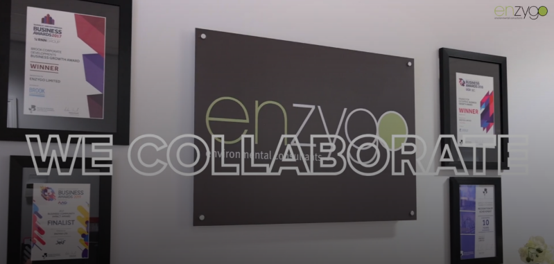
On the other hand, in this shot, I feel that I have done the opposite and haven’t effectively used the graphic. A main reason for this, is the colour of the text clashes with the colour of the wall in the background. Already, this has compromised the aesthetic of the shot, due to parts of the text blending into the wall in the shot. This makes it harder for people with poorer vision to read and digest the information on screen. For a professional product, this takes away the credibility of the product and makes the company appear unprofessional. To avoid this, I need to make sure that graphics aren’t used on a contrasting background, and that shots aren’t too overcrowded before adding graphics on as it takes away from the information that the graphics are trying to show. By overcrowded, I am referring to an abundance of colours or pre-existing writing on photos which take away from the purpose of the shot and stop viewers from digesting information correctly.
On the other hand, this next product takes on an entirely different approach. The video itself is meant to capture the beauty of the shots and have potential clients be more interested in the venue itself instead of the facts surrounding it. This is why the graphics in the video don’t appear often and the most important one is displaying the venue name towards the start, with other facts just being bonuses. This is similar to how I intend to set up parts of my product, such as the preview to Scafell Pike before I begin the ascent. As it is the initial beauty of the shots, which then sets a good starting point for the rest of the product, as the audience’s attention has already been grabbed through the aesthetics of the product.
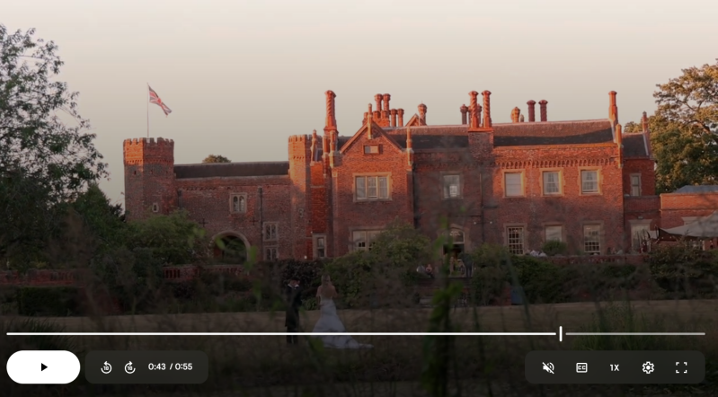
A key part of capturing the beauty in this product is the colour. Depending on how a product is colour graded, it can have a massive impact on whether it both performs well and looks appealing to viewers. For example, this product looks aesthetically pleasing, as the colours match the tone and mood of the shot, with the warmer colours matching in with both the brickwork of the building in the background, but also the factor of people associating something enjoyable with brighter and warmer colours, in a pose to darker and ‘bluer’ tones being associated with something sad and depressing. Not only does this product match in with the mood of the product, but it also fits in with the weather, as it was filmed on a sunny summer’s day which blends well with the more orange tones in comparison to if I tried to make a rain filled shot look warmer with orange tones, as this just wouldn’t blend at all. Overall, by making this product, I learnt how to colour grade effectively, to fit the tone and perception of a product instead of just adjusting colours and hoping for the best, as the colour of a product can seriously affect how a viewer feels whilst watching and after watching a product. This is something I have to seriously consider when editing my own product and trying to create different emotions through scenes and topics.